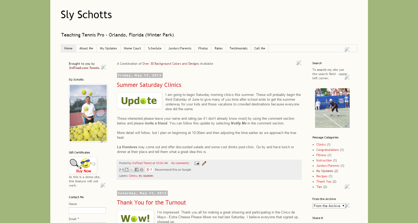
We want you to be able to choose one that suits or pleases you so that you may help us begin building your web site, yet remembering you will have the ability to effect the look and functionality of your new web site later as you become familiar with a plethora of tools and applications.
The following are not the ultimate end to your presence on the Internet, but a fantastic beginning to enable you to personalize your web site, changing the appearance and feel of it over time, on your own or with our assistance.
Effects, like colors (hues, shade, etc.), accents, links, backgrounds and much more can be changed or added by you at a later time.
Choose what works best for you now, then personalize the content of your web site and then look forward to adding your own personal touch to its appearance once you've spent some time with your new web site.
We've had a few new web site owners jump the gun on changing the look of their web site from the get-go, only to find they were reverting back to or choosing another theme. Content and layout is more important in the beginning, and easier when done on a consistent palette.
Much thought and time was put into these, so please have confidence in what we are providing and what you choose.
You can view all themes by selecting the different series which interest you or perusing all of them.
Suggestion: Find the series you prefer, search for the actual theme you like and then write down or remember its name in order to complete your Baseline Info form.
All of the following apply to Web Sites for Teaching Tennis Pros or Web Sites for Tennis Team Captains.
Click on any image to see it in a slide show along with the others.
Designer
These are a few designs that worked elsewhere and here, and a few chosen by customers. We and a few of our web site owners may come up with a few more as time passes.
This series has elements to remind your students or team that you are all about tennis.
Check out the entire Tennis Theme series.
3rdToad
Okay, so we may have gotten carried away with all the bold colors with this series, but hey, it works.
Check out the entire 3rdToad series.
Simple
This series may be your best bet if you want a nice clean look at the beginning or even ultimately.
Note: This series may not lend itself well to incorporating a recognizable background in the future as the main table consumes a large portion of the page. Compare to the Bevel Series.
Check out the entire Simple series.
Bevel
This series is a bolder take on the Simple series and may be a good alternative if you plan on adding your own background image (non-conflicting or confusing) to your site later. Notice all the site components are a layer above the entire page background color.
Check out the entire Bevel series.


No comments:
Post a Comment